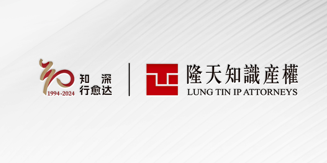
The concept ofLung Tin’s 30th Anniversary Logo is inspired by the Chinese cultural interpretation of "thirty and standing firm," along with the philosophical principle of unity in knowledge and action. Designed to be modern yet rich in meaning, the logo seeks to convey Lung Tin's 30-year milestone andits professional strength in the intellectual property field through a simple, symbolic aesthetic.
The anniversary slogan, “Deep Mastery, Superior Practice,” draws from The Analects interpretation: “The more you practice, the deeper your understanding; thedeeper your understanding, the broader your actions.” It emphasizes thatpractice and understanding are interdependent, each enhancing the other. LungTin expresses through this slogan its profound insights and knowledge gainedfrom three decades of dedication to the intellectual property field, fuelingits path forward toward even broader achievements.

01.Heritage and Innovation


The logo creatively combines traditional and modern elements, with the number “30”artistically crafted to embody a sense of history and heritage. The innovative design also reflects Lung Tin’s spirit of exploration within the intellectual property field.
02. Unity of Knowledge and Action

The combination of the number "30" and the character for "knowledge" symbolizes Lung Tin's expertise, its 30 years of accumulated practical experience, and its guiding philosophy of unity in knowledge and action. This concept highlights the deep integration of theoretical insight and practical application, showcasing Lung Tin’s thoughtful approach and steadfast commitment to development.
03. Sustainable Development and Forward Momentum


The logo’sabstract road shape represents Lung Tin’s steady progress and ongoing expansionin intellectual property field. It signifies a path that extends forward, reflecting Lung Tin's dedication to exploring the forefront of the industry, supporting partners in maximizing commercial value, and building a prosperous future through mutual success.
04. Legacy and Brand

Gold and Lung Tin's iconic red are the primary colors in the logo. Gold signifies prestige, honor, and maturity, echoing the milestone of Lung Tin's 30th anniversary, while Lung Tin red—part of its brand visual identity—reflects the firm's spirit of innovation and pursuit of excellence. This color combination encapsulatesLung Tin's legacy and emphasizes its distinct brand identity.
The 30th Anniversary Logo represents a tribute to Lung Tin’s remarkable achievements over the past three decades and conveys the team's aspirations and commitmentto future development. “Deep Mastery, Superior Practice”—today, Lung Tin standsat a new historical point, steering forward with its founding principles and expertise, propelled by courage and ambition, as it embarks on a new century-long journey!


